Using the economy block, Anne shows different examples of how to direct your attention in a quilt, using light and dark fabrics and contrasting colours.
It is well worth a read and a lot of what Anne has to say relates to contrast in your images too!

Contrast describes the difference between areas. Low contrast means there is not a lot of difference
 between light and dark areas, think foggy mornings or taking photographs on a hazy day. Whites are made less white with a grey tint to them, similarly for black. High contrast is where there is a lot of difference between areas, pure white and pure black for example or complimentary colours like red and green.
 There are different types of contrast e.g, tonal contrast, colour contrast & subject contrast. In photography, when we talk about contrast we usually mean tonal contrast. We should also be aware of Colour Contrast and Subject Contrast, the juxtaposition of odd things together can have great impact too, usually to humourous effect!
Contrast defines the edge of an area. Without contrast the edges can be lost. Anne in her blog post gives a great example of an animal camouflaging itself to its background, blending in. When working in Black & White and you have no colour information tonal contrast is very important.


In these images the RAW files were carefully processed to not blow out the whites and keep detail at the brighter end of the scale while still having areas of darkness with detail too. Master printers, working with film, would use specialised techniques to control the amount of light exposing the negative onto the print. Techniques like dodging and burning (withholding light to make an area darker and allowing more light to make an area lighter) are used to change the exposure in areas of the image.
This change in neighbouring areas can give you increased or decreased contrast and draw attention to one area over another. (If you are a Photoshop user you will see dodging and burning tools available to do the same thing on your digital file).

Our eyes are drawn to the area of highest contrast. In most images, we look at the brightest areas in our images first. In the photo of a park in St. Petersburg, the white seat, white building and clouds in the images above draw your eye upwards .
If you have a dark subject against a white background like this flower the eye will be drawn to the area of highest contrast the edge between the dark and white. In the portrait of Gordon above (before he grew a beard to rival Scott of the Antartic!) we are drawn naturally to the eyes. The highlight in the eyes and the framing by the glasses keeps our attention there. Tip: if taking a photo of someone wearing glasses change your angle to make sure you have no reflections!

We can use this in our photos to direct the viewer where we want to go. In this image of a farmer’s house in Cuba, the eye is drawn past the chairs and the lovely texture of the wood towards that back door. I like it in this image, as it draws you into the photo through the house. Afterwards, you notice the TV and books and ornaments on the shelves.

 In this next image, the bright doorway framed by the wooden posts in this Tobacco drying hut, draws you away from the main subject of the boy. I still like this, as I see myself looking one way and the boy the other but the more traditional shot would be to focus on the boy and what he is looking at. Cropping out the overblown doorway keeps the eye on the boy and his expression and doesn’t draw you away from him. Like lots of things this can be subjective and its your vision that matters in your photos!
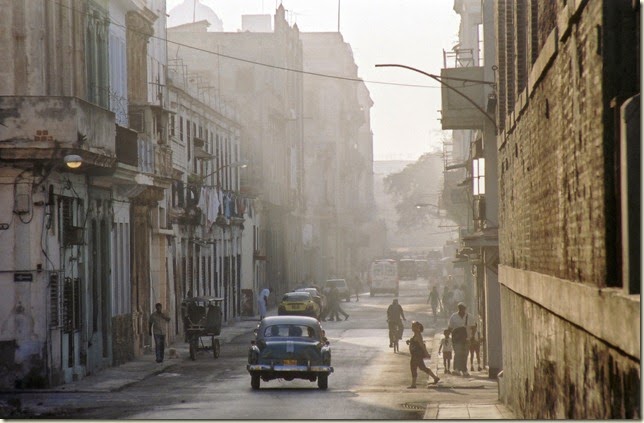
Using areas of high contrast to direct the eye is a photographic composition technique called visual weight. (More on composition later this month! Visual weight describes where the eye is drawn to in an image. In this photo, (my favourite of all the shots I took in Cuba!), this boy taking a break from baseball looks really good against the blue/grey toned street in the evening light.
The eye is drawn to his face and down to that white pocket sticking out and then along his legs to the arms pointing back to the face again. This bright area moves the eye in the image. It’s only afterwards that you notice the gutter and some debris.
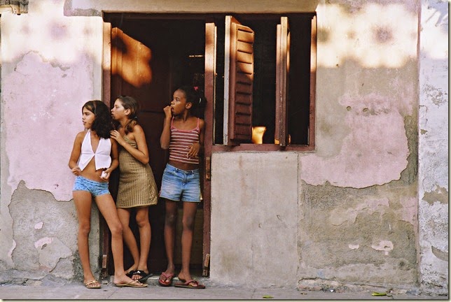
In the image of the girls, the eye sees the bright areas of the wall and the girl's bright top, then their eyes and wonders what they are looking at and then back to the the bright pattern on the walls of a railing casting a shadow. The right hand side of the image of the textured wall is noticed last.

So if you want to draw attention to something in your image think of visual weight and areas of greatest contrast. It’s the same in quilt design! Which of these fabrics is your eye drawn to?


 We mentioned Colour Contrast above and I just want to add that some colours have more visual weight than others. White is eye catching but other colours that draw the eye are red and yellow. This is why they are used quite a lot in safety signs on the road. Lime yellow is actually more eye catching than deep sunflower yellow and is used more on ambulances and emergency vehicles that want to catch our attention when we are driving, so we can give way when needed.
Saturation differences will add contrast as will warm and cool colours used together. Something we quilters love to do!
So contrast defines the edge and the area of highest contrast gives you visual weight. Control of contrast can give you what we call punch in your photos. In post processing software such as Photoshop and Lightroom you have lots of ways you can control contrast. The brightness/contrast command will give some control over global contrast but there are other tools such as Levels and Clarity, Saturation and Vibrance that can give you more flexibility.
Next week I’ll show some examples of how these tools can be used to control Tonal and Colour Contrast in your photos. Subject contrast I will leave up to you!


Once again a very useful post. I tried to contact you by email yesterday Ruth, as I linked to these posts in one of mine.
ReplyDeleteAnother great post!
ReplyDeleteI do enjoy reading your photography posts! I am going to go check out Anne's post now, too.
ReplyDeleteI'm loving your posts! Thanks!!
ReplyDeleteWhat a beautiful collection of photos! I love how to explained each one so well. Photography is my first passion, though it has certainly taken a backseat to quilting in recent years :-)
ReplyDeleteYou have beautiful collection of photos. Great job as usual.
ReplyDeleteThose images are beautiful! Thanks for another great post :)
ReplyDeleteI am loving this photo series you have going. It's very educational, in a good way. Keep up the great posts.
ReplyDelete