 |
| Out of camera on left, processed on right. |
 |
| Source: http://froknowsphoto.com/canon-picture-style-x/ |
Photographs express your vision of the world and you may want to play around with some of these to find styles you like. Coming from B&W photography I tend to like bright with contrast, sharp edges and a bit of punch. You may prefer vintage or low contrast images with subtle colour. This photo, taken in West Cork with the camper van and signposts, was processed for the punchy look we explored last week. Applying a sunny day processing workflow, in the second image, gives us a different feel which is quite vintage looking and suits the old van really well.
Which do you prefer?
And yes that sign does say no dogs allowed! Sheep wander about the place and they are concerned about dog worrying. Not someplace Gordon and I are taking Charly & Wilbur anytime soon!

The Sunny, Summery look suits natural light photos. Use it on well lit and well exposed photos. They won’t suit every picture but for those that do, it works really well. The easiest way to achieve these looks is with Lightroom or Camera Raw if you use Photoshop or Photoshop Elements.
If you shoot RAW, then when you open your image in Photoshop, Camera Raw opens automatically. If you shoot JPEG, you can open an image in Camera Raw by clicking on Open As in the file menu and making sure you have camera raw clicked in the drop down.
Select the image you want to open and it will open up in this menu below. This simple image of a life ring has been auto processed and white balance straight out of camera. To apply a summery look to an image there are a few key adjustments we will want to make. The settings below show the auto adjustments on the file straight out of camera.
 |
| Lightroom panel = Camera Raw |
We need to add light to get that summer feeling. In this case I added a whole stop from the auto correction above (usually anywhere from 0.65 to 1.2 works) and we need to keep contrast, adjusting up to 20 looks good for this. Finally we need to give a colour boost by adding saturation. As we are not interested in protecting skin tones I didn't use Vibrance but added +10 to Saturation. Now the life ring looks super sunny and just shines out from the white railing.
The sunny workflow can be applied to your outdoor craft shots too. If the effect seems too strong you can tone it down in Photoshop elements. Save the image under a new name then copy the image using Select all, control C to copy. Reopen your original image. Then paste into the original file as a new layer using control V. You can then adjust the opacity of this layer to allow the original to come through and reduce the effect to something more natural if you wish.
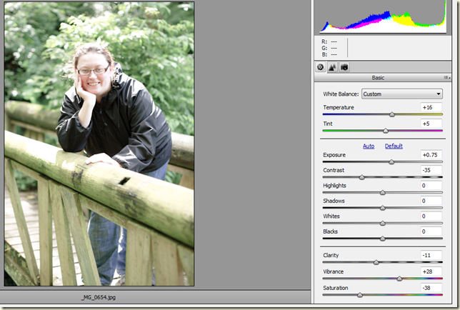
If you want a less saturated more vintage look here is another example. This photo of my friend Mary taken in Tramore, Co.Waterford was taken in bright sunlight but is a bit harsh looking. Taking photos in very contrast light (usually around midday) is very challenging. Applying the workflow as above, increasing the temperature (this time to +16), adding a bit of magenta to offset the green tone (+5), and increasing exposure (+0.75) gives us the full sunshine look. To make this vintage and less full on summer we need to reduce the saturation quite a bit and as we don’t want it too drained of colour I added a bit back in on Vibrance.
I thought this might be a good candidate for negative clarity (which can be flattering on skintones) and reduced this to -11 to soften the image (we spoke about Clarity in the last post here). It has a softer feeling to the photo, still looking nice and summery and a good bit more realistic. Finally reducing the contrast gives the faded soft look of vintage film. A very different look from the original straight out of camera!

Here's another example with Gordon and Ben at the Atlantic coast in Kilkee, West Clare.
Miss that dog every day! Ben was an abnormal Basset Hound (too tall would you believe?)
Hello Sunshine!
Hello Vintage!
Which do you prefer? (I have this one framed as a B&W at home!)
To get the Vintage look, I started with the sunny treatment and warmed up the image. Then added a bit of exposure but this time I increased the shadows a good bit and decreased the highlights to keep some of the blue sky from washing out.
This time around I added something called a split tone. It's basically a colour wash on your image and I have a warm tone of 34 affecting the highlights and a cool tone of over 200 in the shadows. It can give a lovely Vintage feel to your images. It is great fun to play with the split tone panel in Lightroom. You can add all sorts of colour washes to your images.
If you can't be bothered with all that faffing around and prefer to have a recipe on hand for a certain look, you can download presets for Lightroom or actions/plugins for Photoshop. This will give you a Vintage look at the click of a few buttons.
You can find lots of free presets on the Internet for Lightroom that will give you all sorts of looks. Some of the links that I like to use are On One Software, Lightroom Killer Tips, Contrastly, and Presetlove. You load them into Lightroom and can file them in the Develop module to have on hand when you want to apply that certain look!
Plug ins are separate programs that you can buy that are designed for use with Photoshop and Lightroom. My favourites are Nik Software (recently purchased by Google and they have dropped the price!) and Topaz Labs. Nik has a brilliant B&W plug in that helps you create B&W images with gorgeous tonal contrast and they even have a new program specifically for Vintage looks called Analog Efex Pro.
I hope this workflow was useful to you and you have fun with it and checking out all the different styles available to you in your images!
This is the last week of the blog hop but I'd like to do one more post to get to #10 so if there is anything you'd like me to cover next week in my last Photo Friday post of this series please let me know and I will do my best!


I like the vintage look of the photo of Gordon and Ben. I don't have any wonderful requests for next week, but I have been enjoying reading your photography series.
ReplyDeleteLove this series! Happy to know there will be one more. I am hoping to get some time soon to start applying all the wonderful information you have shared.
ReplyDeleteThanks for the photo tips!
ReplyDeleteThis is great once again! Going to see about downloading some looks! Still not super good with lightroom so this may help :)
ReplyDeleteThank you so much for commenting on my blog. Wow, today's post was the clearest explanation of how to make those adjustments in Photoshop and why. Thank you.
ReplyDeleteHi Ruth, I am new to your blog and am happy to have met you through the blog hop. I am just finishing a photography class this month and didn't realize this was a series. I am looking forward to go back and reading all ten posts. I just read this one and the one, where I asked you about shooting with a Nikon in Raw or Raw Fine. Thanks for your thoughtful answer and this helpful post.
ReplyDelete