Showing posts with label LGA 2014. Show all posts

Friday, 18 July 2014

Photo Friday – Workflow for sunshine in your natural light photos

Last week we looked at a bright and punchy workflow to process images.  This week how about a  warm summery workflow instead for a different look?
Out of camera on left, processed on right.
There are many different styles in photography and just like different people have different colour palettes they prefer to work with, the same is true for image processing.  In the menus of your compact cameras you will see lots of different styles that can be applied to an image.  These are not the same as the exposure profile settings like snow or pets or fast moving objects, that pick the best ISO, Shutter speed and Aperture for your photo that we covered earlier.  Picture styles will boost contrast, sharpness and saturation and can affect exposure in some cases also but the intent is to apply a preset to your images to give you a certain look rather like using Instagram as opposed to capturing a perfectly exposed image.

Source: http://froknowsphoto.com/canon-picture-style-x/
For dSLR’s, Canon has 5 standard picture styles for colour images +1 Black & White.  You can even download the picture style editor and create your own recipes if you want.  I prefer to use the Neutral or Faithful setting on my camera and do the processing myself in software.  On compact cameras there are some weird and wacky styles like miniature which I think is great fun!  (Always reminds me of Lego for some reason.)

Photographs express your vision of the world and you may want to play around with some of these to find styles you like.  Coming from B&W photography I tend to like bright with contrast, sharp edges and a bit of punch.  You may prefer vintage or low contrast images with subtle colour.  This photo, taken in West Cork with the camper van and signposts, was processed for the punchy look we explored last week.  Applying a sunny day processing workflow, in the second image, gives us a different feel which is quite vintage looking and suits the old van really well.

Which do you prefer?

And yes that sign does say no dogs allowed!  Sheep wander about the place and they are concerned about dog worrying.  Not someplace Gordon and I are taking Charly & Wilbur anytime soon!

LimerickOct08-1007
The Sunny, Summery look suits natural light photos.  Use it on well lit and well exposed photos.  They won’t suit every picture but for those that do, it works really well.  The easiest way to achieve these looks is with Lightroom or Camera Raw if you use Photoshop or Photoshop Elements.

If you shoot RAW, then when you open your image in Photoshop, Camera Raw opens automatically.  If you shoot JPEG, you can open an image in Camera Raw by clicking on Open As in the file menu and making sure you have camera raw clicked in the drop down.

Select the image you want to open and it will open up in this menu below.  This simple image of a life ring has been auto processed and white balance straight out of camera.  To apply a summery look to an image there are a few key adjustments we will want to make.  The settings below show the auto adjustments on the file straight out of camera.
Life ring std auto
Lightroom panel = Camera Raw
The first thing we want to do is to warm up the image quite a bit, so put the temperature slider away from blue towards yellow.  In this case I used +15.  Play with the tint slider, usually  a figure of 3-5 towards magenta or -8 to -10 towards green usually works quite well.  This is not the same thing as correcting white balance for incorrect colour which we looked at in our very first post.  This is applying a certain style or look to your image, which though it will affect colour, it does so in a pleasant way when used on the right image.

We need to add light to get that summer feeling.  In this case I added a whole stop from the auto correction above (usually anywhere from 0.65 to 1.2 works) and we need to keep contrast, adjusting up to 20 looks good for this.   Finally we need to give a colour boost by adding saturation.  As we are not interested in protecting skin tones I didn't use Vibrance but added +10 to Saturation.  Now the life ring looks super sunny and just shines out from the white railing.


The sunny workflow can be applied to your outdoor craft shots too.  If the effect seems too strong you can tone it down in Photoshop elements.  Save the image under a new name then copy the image using Select all, control C to copy.  Reopen your original image.  Then  paste into the original file as a new layer using control V.  You can then adjust the opacity of this layer to allow the original to come through and reduce the effect to something more natural if you wish.
Hexie Baby layers

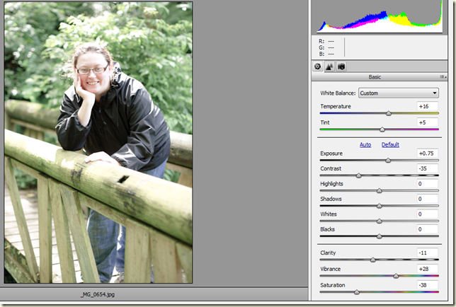
If you want a less saturated more vintage look here is another example.  This photo of my friend Mary taken in Tramore, Co.Waterford was taken in bright sunlight but is a bit harsh looking.  Taking photos in very contrast light (usually around midday) is very challenging.  Applying the workflow as above, increasing the temperature (this time to +16), adding a bit of magenta to offset the green tone (+5), and increasing exposure (+0.75) gives us the full sunshine look.  To make this vintage  and less full on summer we need to reduce the saturation quite a bit and as we don’t want it too drained of colour I added a bit back in on Vibrance.

I thought this might be a good candidate for negative clarity (which can be flattering on skintones) and reduced this to -11 to soften the image (we spoke about Clarity in the last post here).  It has a softer feeling to the photo, still looking nice and summery and a good bit more realistic.  Finally reducing the contrast gives the faded soft look of vintage film.  A very different look from the original straight out of camera!
Vintage Mary low contrast

Here's another example with Gordon and Ben at the Atlantic coast in Kilkee, West Clare.
 Miss that dog every day!  Ben was an abnormal Basset Hound (too tall would you believe?)

Hello Sunshine!

Hello Vintage!

Which do you prefer?  (I have this one framed as a B&W at home!)

To get the Vintage look, I started with the sunny treatment and warmed up the image.  Then added a bit of exposure but this time I increased the shadows a good bit and decreased the highlights to keep some of the blue sky from washing out.  


This time around I added something called a split tone. It's basically a colour wash on your image and I have a warm tone of 34 affecting the highlights and a cool tone of over 200 in the shadows.  It can give a lovely Vintage feel to your images.  It is great fun to play with the split tone panel in Lightroom.  You can add all sorts of colour washes to your images.

If you can't be bothered with all that faffing around and prefer to have a recipe on hand for a certain look, you can download presets for Lightroom or actions/plugins for Photoshop.  This will give you a Vintage look at the click of a few buttons.


You can find lots of free presets on the Internet for Lightroom that will give you all sorts of looks.  Some of the links that I like to use are On One Software, Lightroom Killer TipsContrastly, and Presetlove.  You load them into Lightroom and can file them in the Develop module to have on hand when you want to apply that certain look!


For Photoshop and Photoshop elements you can download actions that you can load and apply to your images.  Some professional photographers will even sell you their recipes.  Paint the Moon have some gorgeous actions for Photoshop that are worth taking a look at, even if just to see what you can actually do with imaging software.

Plug ins are separate programs that you can buy that are designed for use with Photoshop and Lightroom.  My favourites are Nik Software (recently purchased by Google and they have dropped the price!) and Topaz Labs.  Nik has a brilliant B&W plug in that helps you create B&W images with gorgeous tonal contrast and they even have a new program specifically for Vintage looks called Analog Efex Pro.

I hope this workflow was useful to you and you have fun with it and checking out all the different styles available to you in your images!

This is the last week of the blog hop but I'd like to do one more post to get to #10 so if there is anything you'd like me to cover next week in my last Photo Friday post of this series please let me know and  I will do my best!

Plum and June

Wednesday, 16 July 2014

Let's get acquainted, week 4.

Plum and JuneIt's the last week of Plum and June's blog hop for new bloggers!

If you would like to get acquainted with some new bloggers, there are blogging tips and quilting tips on every post as well as introductions.   Please check out the blogs on the hop today and don't forget to visit Beth at Plum and June to enter the giveaway she is running to support the hop!

Wednesday, 9 July 2014

Let's get acquainted!


Hello!  Today it’s my turn on the Let’s Get Acquainted blog hop organised by Plum & June so welcome back and welcome to anyone visiting for the first time!  My name is Ruth and I live with Gordon and our two dogs, Charly (Jack Russell Terrier) and Wilbur (Basset Hound) just outside Limerick City, in Ireland.

Charly & Wilbur make regular appearances on the blog and are great company in the sewing room,  aka  Kitchen!  I sew at the dining room table and have pretty much taken over that whole room. Every now and again I have to clear up when we have people over for dinner!  My design wall is a sheet strung between a mirror and a bookcase and is collapsible!  (Wilbur has pulled it down twice!)
Limerick is my hometown.  It's a hard working town, founded by the Vikings on the banks of the Shannon river and only an hours drive away from the Atlantic ocean, my favourite spot in the whole world!

The blog name comes from Ben our previous Basset that we had from a puppy. He liked to sleep in an old shop bought baby quilt I had. He also liked to chew on it! Puppy teeth are lethal and very quickly there were multiple holes. Figuring it was un-repairable, I decided to try making my own quilt to replace it.

That was 2 1/2 years ago!  Anybody who is reading this and thinking of making a quilt, don't hesitate!  It's so satisfying when you have a finished quilt, you want to dance about the kitchen singing I made this, all by myself - aren't I brilliant!  Of course self praise is no praise, so luckily there are linky parties and friends to cheer you on!

My favourite linky party ever is coming up in August on Lillypad Quilting: Pets on Quilts!  Last year when I entered Charly there was even a hedgehog!  This year will be Wilbur's turn I think!  Doesn't he make a good model?

I find quilting different from the other crafts I play with in a few ways.  There is something collaborative about making quilts even if only sewing at home at the kitchen table. Quilt-A-Longs, Bee's, Flickr and Facebook groups and lately Instagram makes it feel like a real community sharing the process as well as the finished quilt.   I'm CB Crafty Corner on social media because the blog name is waaay too long to type!

I’m in a sewing group & 3 Bee’s at the moment so I post regularly about the blocks I’m making with links to them to try if you want to.  I try to share as many links to things I’ve found useful or just really lovely to make and it helps me too as a craft journal.  I can see how far I've grown in skills and projects.  I also love swaps and just finished up one last week!

More than any other thing this year I’ve really enjoyed designing my own quilts.  I’ve had great fun on the Medallion Quilt-A-Long run by the Modern Irish Quilt Guild and have been working on this hexie centre baby quilt I designed, not finished but getting there!  This one is definitely a candidate for slow blogger link up!


My favourite quilt so far is this one.  It’s a simple design but I really enjoyed the whole process of designing, making it and the changes that happened along the way!

Wilbur pondering a swap!
My quilting tip is to be brave and cut into your fabric!   When I first started quilting I had no confidence in choosing colours or buying prints. Trying to save money I bought the cheapest fat quarters I could find and it was always a struggle to get the look I wanted from my first blocks.  Now I think just buy the fabric you really like and don't be afraid to use it!  I do still have a few oh I'm going to make a mess of this moments but thankfully they are fewer than they were!  Try something new (maybe not with your most, best fabric – I’ve been hoarding a Kate Spain Fat Quarter Bundle for over a year.  But just the one!)  If you get stuck on something just ask!  I've had so much support and great help when I've reached out for it on the blog - thank you all for all your help!  It is much appreciated.

My blogging tip has to be a photo tip!  Most of the time we try to take photos straight on to be accurate and show someone what we are doing.  Take those shots but try changing up your angle, get down low, hunt around for the shot and you may find something different!

Some random facts about me
  • Photographer – Love B&W photos & I collect vintage cameras, bought 3 box brownies on eBay for 12 quid!  Though lately I’m collecting camera fabric instead!  
  • Engineer (Mechanical – Materials & Design)
  • Love NCIS -  The Gibbs one!
  • Books I’ve read more than once – Pride & Prejudice, The Hobbit, I am Legend and favourite writer is Ursula Le Guin.  Love her Earthsea books!
  • Love learning – currently addicted to Coursera.org and learning about animal behaviour!  I’m probably addicted to Craftsy too!
  • No kids but Godmother to 3 kids of friends and family, lots of cousins!
  • Actively trying to persuade Gordon and my mother (who is key in all decision making!) that we need another Basset Hound in the house!
  • Hate mushrooms!  (Am I alone in this?  Does anyone else have a food they absolutely hate?)
As part of the blog hop we’ve been helping each other out with tips and I didn’t realise I had the anti-spam number verification thing turned on.  Apologies to all who had to jump through hoops to leave me a comment and thank you for making the effort.  It’s turned off now!

For more quilting and blogging tips and to get acquainted with some new bloggers please visit my fellow blog hoppers today:

Shauna @ Shauna's World

Pam @ 
Sewing Wilde

Wendy @ Wendy's Quilts and More

Jan @ 
The Colorful Fabriholic

Carole @ 
From My Carolina Home

Lin @ Lin's Quilts

Helga @ Green Mill Vintage

Kate @ Thread Everywhere

Cheryl @ Texas Quilting Gal

Jenn @ Sew Crafty Jenn

Heather @ Bobbins and Bullets 

Cornelia @ 
Pieced With Love XOXO
Plum and June

Monday, 16 June 2014

Blog update & HST downloads

In advance of my turn on Plum & June's Let's Get Acquainted Blog Hop, I've been tidying up the blog a bit and have put up two new downloads available here.  I'm exploring ways to make Half Square Triangles for a post for the Modern Quilt Guild of Ireland page and made up 2 cheat sheets, that I thought would be helpful.

The first is for calculating the starting square you need for a given size of HST to make 4 at a time.  I've put HST unfinished sizes 1 1/2" to 8 1/2" (1" to 8" finished!) and the starting square you will need to create these using the speedy method shown by Missouri Star Quilt Company.  The formula is there to calculate other sizes.  I normally round up to allow a little wiggle room and trim my HST's afterwards!

The second is for the more traditional drawn line method showing how to make 2 at a time and 8 at a time.

I've also updated the Gallery page and added a Photo Friday page, linking to the Tips & Techniques on photography, that I've written about during this blog hop.

We have been critiquing each others blogs and if there is anything you don't like or any improvements you think I could make please let me know.

I am open to all suggestions and want to make this space a place to share links, tips, process of making a quilt and current projects as accessible as I can.

I hope you enjoy the downloads and find them useful! Plum and June

Friday, 13 June 2014

Photo Friday - 5 ways to use Depth of Field and Selective Focus

This is part 4 of a photo series I'm writing while the Let's Get Acquainted Blog Hop for new Bloggers is running, through June and July.  For parts 1-3 see Photo Friday tab above!

Depth of field in photography, refers to the zone of sharpness you capture with your camera settings.  When taking landscape photos we want all the scenery in front of us in focus from the grass a few feet away to the hills in the distance.  This requires a deep or wide depth of field (zone of sharpness) throughout the image.  


A shallow depth of field has a very narrow focus or sharp plane but a wide area of no sharpness or blurred area.  It can result in very pleasing photos, as it emphasises the subject in the sharp zone and de-emphasises anything in the blurred zone.  This can eliminate distracting elements in the background that otherwise would draw your eye away from  the subject. 
  
Control of depth of field is a useful technique to have when taking craft photos.  It can help make your images more appealing.   It’s not just useful to show off fabric bundles (though we love those photos!),  it can also make your images more informative by emphasising an area you wish to concentrate on.

 Giveaway-4 _MG_6066

When thinking about depth of field in your craft photos there are a number of ways it can be used.
  1. Wide depth large area of sharpness 9169868576_baa5a48f37_o
  2. Very shallow with main subject sharp and all else out of focus _MG_6070
  3. Not so shallow with main subject sharp and a hint of the background_DSF6554 _DSF6275 
  4. Selective focus to deliberately highlight an area, very useful when writing tutorials dogwood cushion-1 _DSF0023
  5. Give visual interest to something that might not be too exciting in and of itself, as in these photos of scraps!
_DSF0111_DSF6306 
So how to you control depth of field in your images?  There are a number of factors that affect depth of field but one of the most important is aperture.

Aperture is one of the settings the camera uses to control the amount of light that reaches the sensor.  Simply put, it is the amount the lens opens and is calibrated in f stops.  On older lenses, the aperture was controlled by a ring on the lens that allowed you to open the lens to let in more light for a given shutter speed.  (The aperture controls the lens opening and the shutter speed controls how long the light coming through this lens opening is allowed to hit the sensor.) If you don't have a control ring you can change the aperture in the menus or use aperture priority on your camera.


If you open the lens up wide, you will be using a small aperture number.  It seems counter-intuitive but like thread numbers, the smaller the number the thicker the thread, you get used to it pretty quickly.  The smaller the number, the larger the opening!

This is very useful for when there is not a lot of light and wide aperture lenses are often used for low light photography.

The numbers themselves are based on the square root of 2 which is 1.414 (has to do with the geometry of a circle).  They increase in multiples of 1 and 1.414 and each jump lets in twice the amount of light.  The values are 1, 1.4, 2, 2.8, 4, 5.6, 8, 11, 16, 22, 32 etc.

As the numbers increase, the opening decreases and you will need to allow the shutter to stay open for longer, for the same exposure at each aperture.

In terms of depth of field and the perceived zone of sharpness, the aperture has a huge influence on this.  The wider the aperture (lower the number) the shallower the depth of field.  In f/2.0 the aurifil threads behind the blue are really blurred, less so at f/5.6 and it's not until we get to f/16 that the second thread is sharp.  So, if you want a shallow depth of field with a large background blur, you need to open up your aperture and use the lower numbers for your photos.

After aperture the next thing to think about is the distance to the subject.  Getting closer to your subject will reduce the depth of field and create a shallow zone of acceptable sharpness.   If you change nothing else but change your field of view and use the zoom end of your lens (or a longer focal length lens) you create more background blur!  Zooming in will give you a narrower field of view and make the subject in the lens bigger without you moving towards it.  This will give the appearance of a shallower depth of field in your photos.  So if you are not getting the shallow depth of field you want try getting closer or zooming in!

The other thing you can do is to increase the distance between your subject and your background.  It is easier to blur the background if the subject and background have some distance between them.  Lens optics will blur the background in a different way (called bokeh).  Some lenses are known for an appealing bokeh and can be quite expensive!  If you have a dSRL a 50mm lens is an inexpensive option.  Canon's 50mm lens comes in a version with a maximum aperture f/1.8 for about $110.


The camera you chose to shoot with, will also affect the depth of field.  The larger the sensor in your camera, the shallower the depth of field will be at a given aperture.  A full-frame dSLR camera produces a much shallower depth of field than an APS-C sized sensor dSLR and in turn both produce more than a compact camera (at equivalent focal lengths and apertures).  In order to have the subject the same size in your image, you will need to move closer to the subject or use a longer lens in a full frame camera than you would in a compact camera.

If you shoot with a compact camera with no aperture adjustment available, you can usually find a portrait mode in the menus.  When taking portraits, we often want to concentrate on just the subject, emphasise the person in the photo and reduce or eliminate any distractions in the background.  If you  chose the portrait setting this is what the camera will try and do.

When taking portraits the eyes are key.  If they are not in focus the image will not look sharp.  With shallow depth of field if you focus in the wrong place, critical parts of the image will fall outside the sharp zone as in this photo of mum and my cousin.

The camera autofocus has focused on mum’s sleeve and it and the ball are in the sharp zone.  Mum not so much!  Shallow depth of field can require careful focusing and you may need to override the autofocus or chose a focus point you want the camera to use.

Both these images of Charly & Wilbur use very shallow depth of field (I was down on the floor on their eye levels and very close to them with the camera to get these shots) but because the eyes are in the sharp zone the images look correct even if their ears and noses aren’t!


Similarly in our craft photos, the area in the image that we see as sharp will be affected by where you chose to focus.  Typically 1/3 distance in front of the focus point and 2/3rs behind will be sharp (increases to a more 50/50 with longer focal lengths!)

The wider the aperture you use,  the closer you are to the subject and the narrower the field of view (zoom in or use a lens with a long focal length) the more blur is created, and the shallower the acceptable sharpness zone will appear.   With a very shallow zone of sharpness the focus point becomes very important!

If you've made it this far thanks for sticking with me!  Hope these tips and explanations help you use depth of field in your images!  More next time and don't forget to check out the new bloggers on the hop for both quilting tips and blogging tips.

Plum and June

Related Posts Plugin for WordPress, Blogger...