Showing posts with label Photo Friday. Show all posts

Friday, 25 July 2014

Photo Friday - Wide Dynamic Range

Ever taken a photograph like this?  On a sunny day where there are bright spots and dark shadows in your photo,  you get a big contrast between light and dark.

Remember in this previous post, we said areas of greatest contrast draw the eye.  In this image, the eye bounces all over the place and has no where to rest. This is a problem of too much contrast. The answer to this one, is to wait for a cloud, look for even, open shade (stand the subject all the way under a tree) or wait for a later time of day to take the photo.

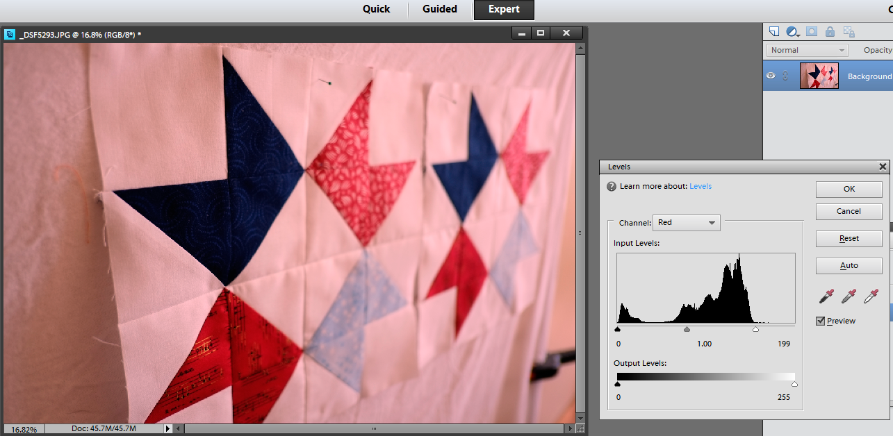
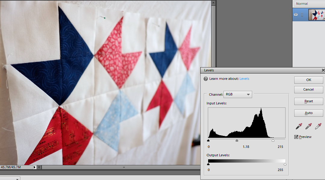
I posted this when I was finally finished this quilt top.  I was so happy to be finished, I didn't worry about the photo at all!  So I'm as guilty as the next person!

Sometimes though when you are on holidays, and out and about, and can't move the subject into better light what do you do?  

In these photos with a wide range of tonal contrast, (difference from lightest to darkest parts of the image), the camera sensor will find it tricky to expose the scene.

In this first image, the boats are well exposed, we have a nice sun flare effect but the sky in the distance is blown out to white.  There is no detail recorded here so there is nothing for us to work with. The camera exposed for the boats and sacrificed the sky.

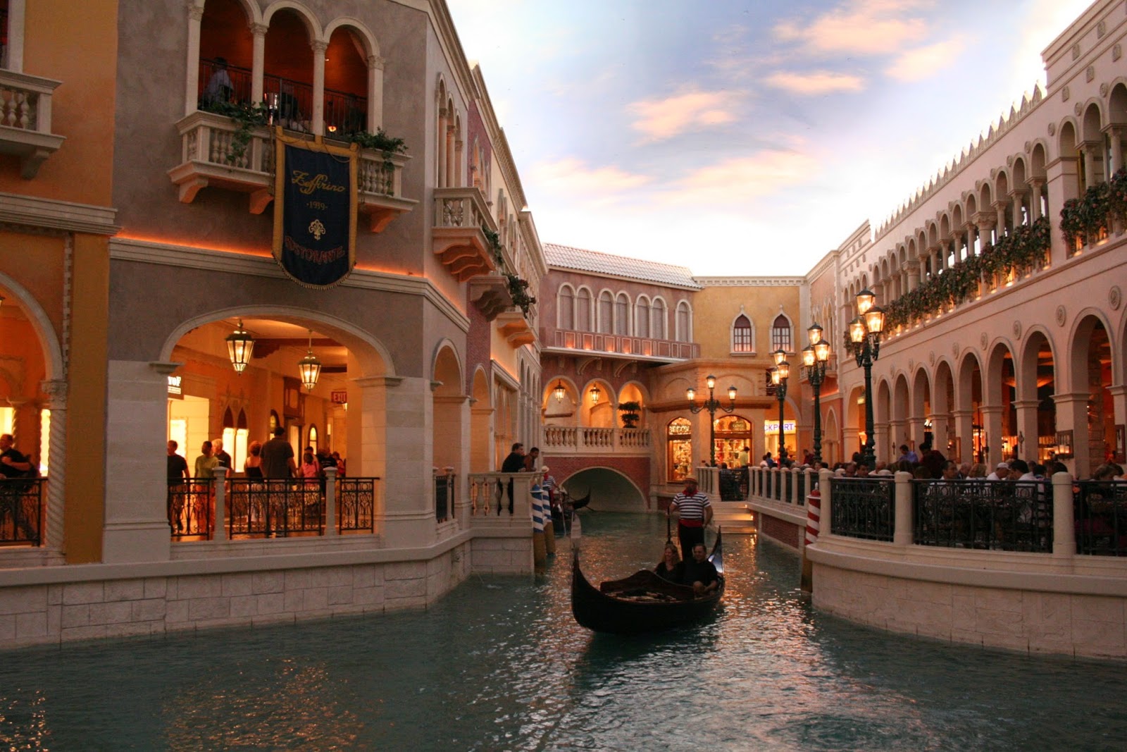
In the second photo, taken in the Venetian hotel in Las Vegas the sky has been recorded and the foreground is now too dark.

Our eyes are amazing at adapting to differences in light, but camera sensors as well designed as they are, can only record a portion of what we can see in terms of tonal contrast.

As we saw when looking at camera noise, different sensors will have a different range of light to dark that they can record.  This is called Dynamic range.  A good camera sensor will pick up 10-14 stops of light.  As with noise minimisation, the bigger the sensor, the more modern the camera, the better the dynamic range.  There are things you can do when faced with tricky lighting like this to maximise your chances of getting a good image.

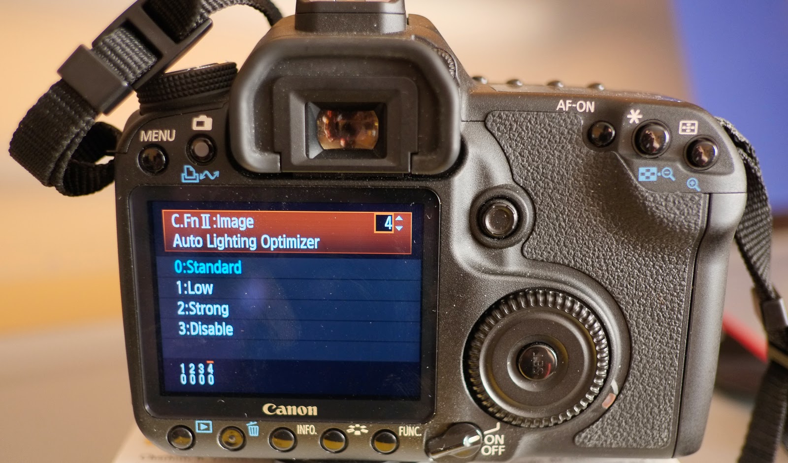
Some cameras have custom features that you can enable.  Nikon has a custom function called active D lighting that you can turn on in in the menus.  Fuji makes it easy and calls their custom function Dynamic Range.  Canon has Auto Lighting Optimiser (ALO).  This preserves shadow detail in high contrast scenes and tries to even out the image to improve the look.  If you want to preserve highlight detail, Canon has a custom function called Highlight Tone Priority (HTP) which sacrifices the shadows by 1 stop and preserves highlights (wedding photographers love this for shooting the bride).  Just remember to turn it off again when you don't need it, as you will get increased noise in the shadows.

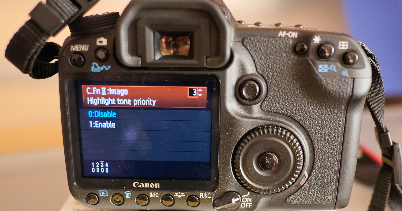
Shooting using RAW rather than JPEG will gain you an extra two stops of dynamic range.  We saw in an earlier post that processing in Camera RAW can help recover some of the highlight information.  If you are shooting JPEG's and blow out your highlights you can't get this information back!  There are times though when shooting RAW still won't be enough!  For those times, or if you don't have RAW available to you on your camera, you can try the following:

Crop out the sky or change the angle, remove the lightsource.  The lightsource will usually be the brightest part of the image (sometimes reflective surfaces will give a really bright highlight).  By pulling the curtains here in the Caravan at the West Coast of Ireland, even though they are patterned!, they keep the bright light from outside dominating the shot and allow a nice exposure of the main subjects (I'm on the far right!).

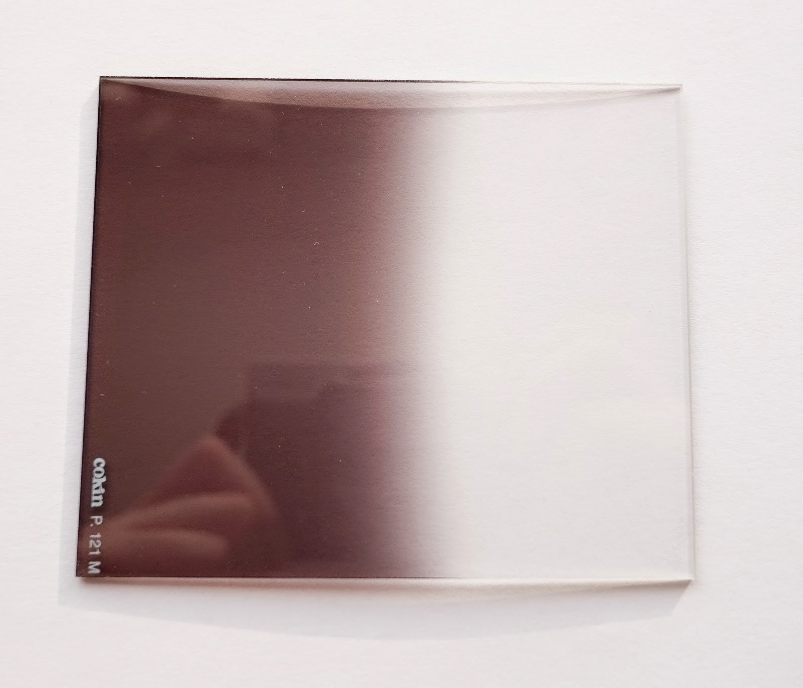
Taking interior shots with a view to outside is always a tricky dynamic range shot, as is very bright skies on a sunny day.  If you can't crop out the sky in your image, you can use a graduated neutral density filter.  A Neutral Density filter will allow some light to pass through without changing its colour.  (Coloured filters are available too that are in full and graduated versions to give you bluer skies or sunset effects with a tobacco/orange colour!)  A graduated neutral density filter is grey on top and clear on the bottom.  Place the transition at the horizon and the sky will darken and the foreground will remain unaffected.

Lightroom has a graduated filter adjustment that you can paint on by hitting the M key or clicking in the rectangular box in the adjustment panel in the develop module.  You can pull your filter down and vary the angle you want to use and then adjust the exposure to make the sky darker or brighter.


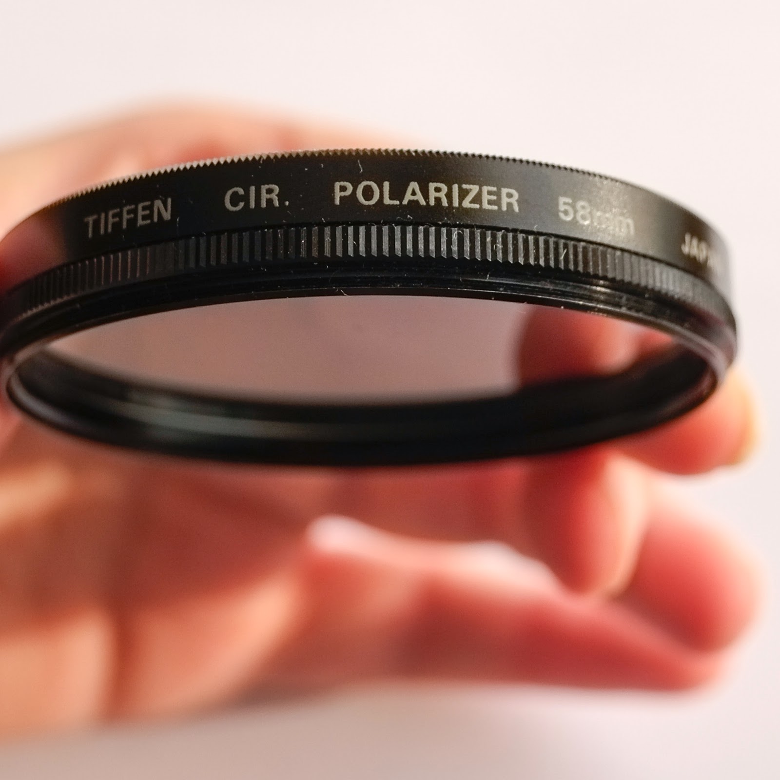
Another useful filter to have to cut out reflections and give you clear blue skies, is a Polarising filter.  A Polarising Filter will cut down on the amount of light entering the camera (usually 2 stops) and the camera will adjust to use a slower shutter speed or increased aperture but the effect on your image is very important.  It will reduce the effect of glare off non-metallic reflective surfaces like light on water and can help make blue skies more blue by increasing saturation.  A circular polariser is used with auto-focus cameras and you turn the filter until you get the effect you want.

(If you have too much light in general an adjustable neutral density filter available from -1 stop to -10 stops can be used.  Landscape Photographers love this as it allows them to use a slow shutter speed to blur water even in bright sunshine.  See Lee's website for examples of filters in action).

Adding light can help lift shadows and reduce the difference between dark and light.  You often see film crews lighting up a scene in broad daylight.  Adding light with flash is very useful for those interior shots we mentioned above as it helps balance the light inside with outside.  It is also very useful for backlit subjects when you don't want to capture the subject as a silhouette.

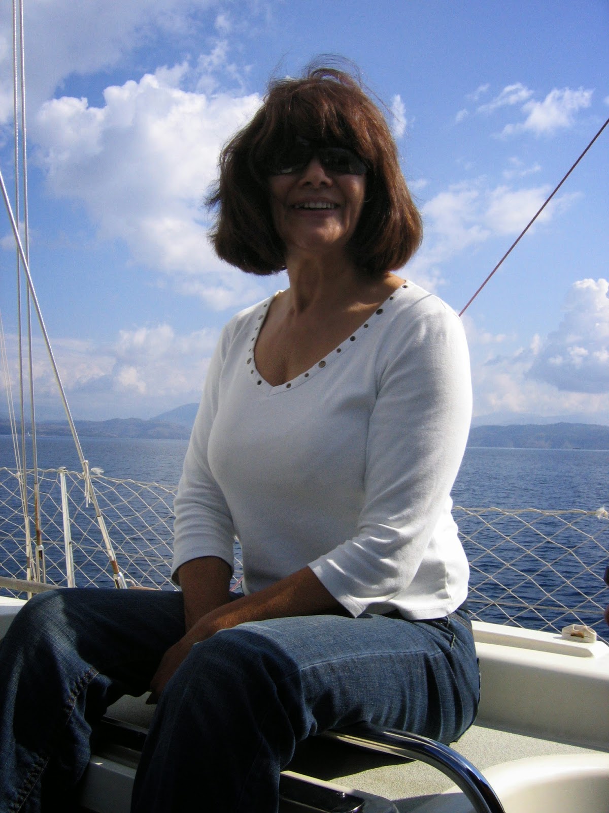
Gordon's mum Ann is backlit here by the light coming in from the right.  This was a snapshot taken on a boat in Corfu and when taking sneaky candid shots you can't ask the subject to turn into the light nor is there that much room on a boat to move around and not get in someones way!

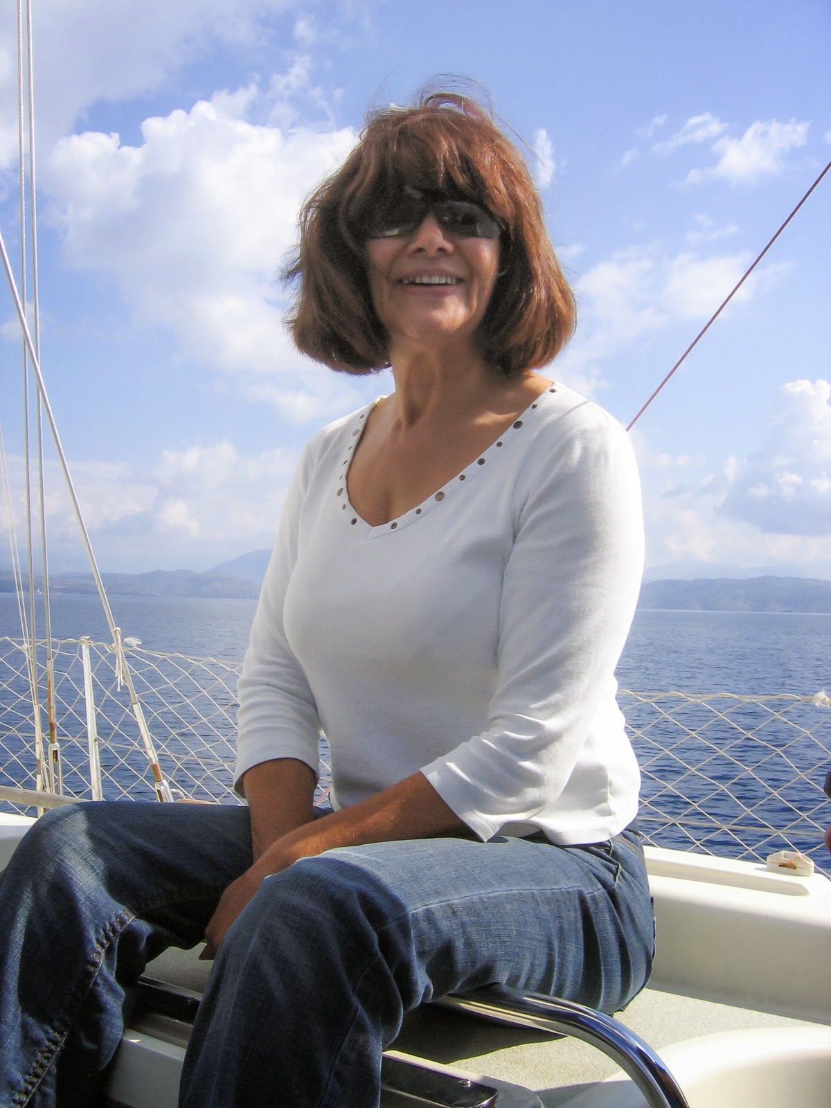
Ann's face is quite dark and even though it is a bright sunny day the easiest way to handle this is to add light.  Fill flash is often used by portrait photographers to lift the shadows around the eyes and to brighten up the face.  A reflector would be a good option here but chances of having a reflector on hand when you are on holiday are slim!  Turning on the flash even in bright sunshine and adding some fill light makes a difference!  Lightroom simulates this using the shadows slider and moving it to the right.

A very common lighting set up is to use the directional light from a large window to light up your subject and then bounce some light back to reduce the shadows.  A piece of white cardboard can work really well as a reflector or wrap the cardboard in reflective tin foil or cooking foil to bounce even more light in.

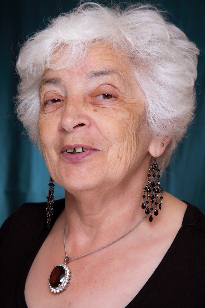
In this photo of my mum I used a golden reflector to bounce light back up into her face and keep the image warm.

Lastly if all else fails you can bracket your shots by taking multiple exposures and combining them later in software.  Some high end cameras will even do this for you in camera.  You can combine one exposure for foreground and one for sky or you can take multiple exposures at different exposure compensation amounts, usually -2, -1, 0, +1, +2.  These are then combined in software for processing to a final image.  A tripod is an essential tool when doing this to hold the camera in the same position for all 5 exposures. Combining multiple exposures like this is called High Dynamic Range (HDR) photography.

There is specialist software available for this outside of Photoshop.  Photomatix is very popular and one of the links, I provided last week for Photoshop plug ins,  was Nik Software.   They have a program with presets called HDR Efex Pro.  You can go really mad with this and end up with an image from outerspace or go realistic and end up with a more natural effect.  It is a versatile technique that can get you the look you want in challenging high contrast light.

So that's it for this series of Photo Friday.  Thanks for sticking with me and I hope you find these techniques and tips useful in your craft and everyday photography!


Friday, 18 July 2014

Photo Friday – Workflow for sunshine in your natural light photos

Last week we looked at a bright and punchy workflow to process images.  This week how about a  warm summery workflow instead for a different look?
Out of camera on left, processed on right.
There are many different styles in photography and just like different people have different colour palettes they prefer to work with, the same is true for image processing.  In the menus of your compact cameras you will see lots of different styles that can be applied to an image.  These are not the same as the exposure profile settings like snow or pets or fast moving objects, that pick the best ISO, Shutter speed and Aperture for your photo that we covered earlier.  Picture styles will boost contrast, sharpness and saturation and can affect exposure in some cases also but the intent is to apply a preset to your images to give you a certain look rather like using Instagram as opposed to capturing a perfectly exposed image.

Source: http://froknowsphoto.com/canon-picture-style-x/
For dSLR’s, Canon has 5 standard picture styles for colour images +1 Black & White.  You can even download the picture style editor and create your own recipes if you want.  I prefer to use the Neutral or Faithful setting on my camera and do the processing myself in software.  On compact cameras there are some weird and wacky styles like miniature which I think is great fun!  (Always reminds me of Lego for some reason.)

Photographs express your vision of the world and you may want to play around with some of these to find styles you like.  Coming from B&W photography I tend to like bright with contrast, sharp edges and a bit of punch.  You may prefer vintage or low contrast images with subtle colour.  This photo, taken in West Cork with the camper van and signposts, was processed for the punchy look we explored last week.  Applying a sunny day processing workflow, in the second image, gives us a different feel which is quite vintage looking and suits the old van really well.

Which do you prefer?

And yes that sign does say no dogs allowed!  Sheep wander about the place and they are concerned about dog worrying.  Not someplace Gordon and I are taking Charly & Wilbur anytime soon!

LimerickOct08-1007
The Sunny, Summery look suits natural light photos.  Use it on well lit and well exposed photos.  They won’t suit every picture but for those that do, it works really well.  The easiest way to achieve these looks is with Lightroom or Camera Raw if you use Photoshop or Photoshop Elements.

If you shoot RAW, then when you open your image in Photoshop, Camera Raw opens automatically.  If you shoot JPEG, you can open an image in Camera Raw by clicking on Open As in the file menu and making sure you have camera raw clicked in the drop down.

Select the image you want to open and it will open up in this menu below.  This simple image of a life ring has been auto processed and white balance straight out of camera.  To apply a summery look to an image there are a few key adjustments we will want to make.  The settings below show the auto adjustments on the file straight out of camera.
Life ring std auto
Lightroom panel = Camera Raw
The first thing we want to do is to warm up the image quite a bit, so put the temperature slider away from blue towards yellow.  In this case I used +15.  Play with the tint slider, usually  a figure of 3-5 towards magenta or -8 to -10 towards green usually works quite well.  This is not the same thing as correcting white balance for incorrect colour which we looked at in our very first post.  This is applying a certain style or look to your image, which though it will affect colour, it does so in a pleasant way when used on the right image.

We need to add light to get that summer feeling.  In this case I added a whole stop from the auto correction above (usually anywhere from 0.65 to 1.2 works) and we need to keep contrast, adjusting up to 20 looks good for this.   Finally we need to give a colour boost by adding saturation.  As we are not interested in protecting skin tones I didn't use Vibrance but added +10 to Saturation.  Now the life ring looks super sunny and just shines out from the white railing.


The sunny workflow can be applied to your outdoor craft shots too.  If the effect seems too strong you can tone it down in Photoshop elements.  Save the image under a new name then copy the image using Select all, control C to copy.  Reopen your original image.  Then  paste into the original file as a new layer using control V.  You can then adjust the opacity of this layer to allow the original to come through and reduce the effect to something more natural if you wish.
Hexie Baby layers

If you want a less saturated more vintage look here is another example.  This photo of my friend Mary taken in Tramore, Co.Waterford was taken in bright sunlight but is a bit harsh looking.  Taking photos in very contrast light (usually around midday) is very challenging.  Applying the workflow as above, increasing the temperature (this time to +16), adding a bit of magenta to offset the green tone (+5), and increasing exposure (+0.75) gives us the full sunshine look.  To make this vintage  and less full on summer we need to reduce the saturation quite a bit and as we don’t want it too drained of colour I added a bit back in on Vibrance.

I thought this might be a good candidate for negative clarity (which can be flattering on skintones) and reduced this to -11 to soften the image (we spoke about Clarity in the last post here).  It has a softer feeling to the photo, still looking nice and summery and a good bit more realistic.  Finally reducing the contrast gives the faded soft look of vintage film.  A very different look from the original straight out of camera!

Vintage Mary low contrast

Here's another example with Gordon and Ben at the Atlantic coast in Kilkee, West Clare.
 Miss that dog every day!  Ben was an abnormal Basset Hound (too tall would you believe?)

Hello Sunshine!

Hello Vintage!

Which do you prefer?  (I have this one framed as a B&W at home!)

To get the Vintage look, I started with the sunny treatment and warmed up the image.  Then added a bit of exposure but this time I increased the shadows a good bit and decreased the highlights to keep some of the blue sky from washing out.  


This time around I added something called a split tone. It's basically a colour wash on your image and I have a warm tone of 34 affecting the highlights and a cool tone of over 200 in the shadows.  It can give a lovely Vintage feel to your images.  It is great fun to play with the split tone panel in Lightroom.  You can add all sorts of colour washes to your images.

If you can't be bothered with all that faffing around and prefer to have a recipe on hand for a certain look, you can download presets for Lightroom or actions/plugins for Photoshop.  This will give you a Vintage look at the click of a few buttons.


You can find lots of free presets on the Internet for Lightroom that will give you all sorts of looks.  Some of the links that I like to use are On One Software, Lightroom Killer TipsContrastly, and Presetlove.  You load them into Lightroom and can file them in the Develop module to have on hand when you want to apply that certain look!


For Photoshop and Photoshop elements you can download actions that you can load and apply to your images.  Some professional photographers will even sell you their recipes.  Paint the Moon have some gorgeous actions for Photoshop that are worth taking a look at, even if just to see what you can actually do with imaging software.

Plug ins are separate programs that you can buy that are designed for use with Photoshop and Lightroom.  My favourites are Nik Software (recently purchased by Google and they have dropped the price!) and Topaz Labs.  Nik has a brilliant B&W plug in that helps you create B&W images with gorgeous tonal contrast and they even have a new program specifically for Vintage looks called Analog Efex Pro.

I hope this workflow was useful to you and you have fun with it and checking out all the different styles available to you in your images!

This is the last week of the blog hop but I'd like to do one more post to get to #10 so if there is anything you'd like me to cover next week in my last Photo Friday post of this series please let me know and  I will do my best!

Plum and June

Friday, 11 July 2014

Photo Friday – Contrast & adding punch to your photos, part 2

Last week, we looked at the different types of contrast, tonal, colour and subject contrast and how you can use it in your images to give visual weight and draw attention to areas in your image.  This week, I’m looking at some of the controls available to us in photo processing software to help control tonal and colour contrast in your images.


If you want a delicate high key image you would not want too much contrast but enough to define your subject.  If you want a punchy image then control of contrast is key.  Too much contrast will give your images a harsh appearance.  The image on the left has a flat look to it after I scanned the photo.  Adding contrast gives a richer looking image giving greater depth to the blacks and a crispness to the whites.

Like anything in Photoshop, there are a number of ways to control & add contrast to your images.  The Brightness/Contrast command is a global command and affects the whole image.  Photoshop’s original algorithm for Brightness/Contrast was easy to misuse and add in too much black.  This has since been improved in the current version but a lot of photographers avoided it and used Levels or Curves instead.

Levels is one of my favourite adjustments to make and most images straight out of camera can benefit from Levels.  Pixlr the online free processing software includes Levels and it is available in Photoshop and in Photoshop Elements in the Expert menu under Enhance/Adjust lighting.  It is also available as an adjustment layer in the Layers drop down.

Levels displays a histogram (see earlier post for an explanation of the histogram) of the image showing a graph of tones from dark at the left hand side (0 value) to pure white at the right hand side, (value of 255).  You can choose each of the colour channels individually or chose a combined RGB graph.  The idea here is spread the graph across the tones thereby increasing the difference between black and white thus increasing contrast and brightness.  You do this by moving the sliders (small triangles under the graph) up to the point where the curve begins to rise.
 

You can do this for each channel individually and tweak the colour in your image or for the combined RGB in one go.  If you change the channels one at a time, you will get funny colours in the between steps until all 3 channels have been adjusted.

You can do the same for the darks and the midtones by moving the sliders and seeing what the effect is on your image.  Adjusting the midtones to the right towards the white, actually reduces the lightness in the midtones and towards the left adds light to brighten your image.

I rarely use the eyedroppers preferring to adjust myself with the sliders but they work by clicking on the white dropper and then clicking on an area in your image that should be white.  I'm not a fan of auto adjustments but Levels auto works 95% of the time so try it and see!

As we have seen, Levels can be used to adjust colour and if you use Auto you may find your colours adjusted too.  The way I like to use levels is as a layer adjustment from the layers drop down menu.


Photoshop creates a new layer and the original image underneath is not changed.  This gives you a non-destructive workflow.  It is important to protect your original against changes you may wish to undo at a later stage and layers is a great way to do this.  If you don't like what you have done for some reason, you can always delete or hide the layer by clicking on the eye and the effects will no longer be seen.

Change the layer type from normal to luminosity and the levels adjustment will only affect the brightness/contrast in your image and not your colours.  I like to play with the opacity of this layer often reducing it to 60-65% to tone down the adjustment.  This gives lots of control.

There are other commands like shadows/highlights, curves and equalise that can adjust contrast but after Levels, I like to do a targeted contrast boost to the midtones.  This can really give punch to an image if that is the look you want.  It's called Local Contrast Enhancement (LCE) and is done using Clarity in Camera RAW or Unsharp Mask in Photoshop or Pixlr.  This photo on the left of stipple quilting has had Unsharp Mask applied below (normally used for making things sharper!) and has increased the difference between light and dark in the midtones to give more definition to the quilting.


Again when using Unsharp Mask this way, I like to create a new layer to use it on and adjust the opacity to vary the strength. To do this, right click on your existing layer and select duplicate, then apply Unsharp Mask from the Enhance menu in Elements. Change the settings to the following: Amount 20%, Radius 50, Threshold 0. I adjust the layer opacity to change the strength rather than trying to change these settings and I find this the quickest way to do this outside of Camera RAW.


Camera RAW and hence Lightroom, has Clarity (same as LCE) as part of the workflow in processing your image.  Camera RAW allows you to not only apply a positive value of Clarity to increase midtone contrast (leaving highlights and shadows alone), it also allows you to apply negative Clarity to your image.

Tip: While not that useful in quilt photos if you are taking portraits and want to even out skin tone you can use negative clarity to to do this.  It has the most natural effect when added manually using the adjustment brushes in Lightroom as applying it overall can soften the image. If you want to emphasise every wrinkle and have a grungey look then add positive clarity!


LCE or Clarity is very useful for cutting through haze in images and reducing the effect of lens flare.  Landscape photographers love it and you will find a preset in Lightroom for it on the left hand menu in the Develop Module and yes, it is called Punch!

The remaining two sliders on the Camera Raw basic panel are Vibrance and Saturation.  Remember areas of different saturation can give you colour contrast.

In Photoshop elements the Hue/Saturation command will let you adjust each colour individually or all colours under Master.  I don't like this command much and unless I really have an issue (red sometimes can be problematic!) I prefer not to change the Hue, Saturation or Lightness with this and prefer to use the Sponge command instead if I want to paint on saturation in a specific area.

Painting in saturation is great fun.  Again create a second layer by right clicking on the original layer and choosing duplicate and paint on that leaving your original image alone.  You can reduce the strength with opacity or if you make a mistake this layer can be discarded and your original image is still intact.  If you apply the Sponge command a second time on the same area, it adds more saturation again.  You can change to desaturate and remove saturation if you like and the other two tools in this command set are Dodge and Burn (adding and removing exposure) that we spoke about last week.


The easiest way to add saturation globally is with Camera Raw. Have you ever added saturation to an image with a person in it and their face has gone a horrible shade of scarlet?  Well Vibrance can help.  Vibrance protects skin tones and allows other colours to be adjusted.  Vibrance is what I use most if I need to make a saturation adjustment.


Camera Raw can be used on both JPEG's and RAW files and makes tweaking your images out of camera to get the look you want easier.  If Punchy is the look you want then give Clarity and Vibrance a try!

Next week, I'm looking at a warmer processing technique that gives a vintage or summery feel to our daylight images and can really make your photo shine!

Plum and June

Related Posts Plugin for WordPress, Blogger...