
Let's talk about neutrals!
In modern quilting, neutral background colours are often white and grey. Kona White, Snow and Bone being really popular in the whites and Kona Ash being the most popular grey.
In the colour intensive course I did with Stiched in Color, Rachel Hauser gave us White, Black, Grey and Brown toned colours as neutrals. Some of those tones are cream, champagne, beige, and tan. I know modern quilters usually shy away from brown but when used with bright colours like yellow or neon green it can really work! Try thinking of brown as dark orange and maybe you might use it a bit more?
Instead of the starkness of black I have loved using Kona Navy and for a while seemed to making only navy based quilts!

From time to time I get bored with solids and go low volume too for a change - I think low volumes fall into the neutral category!

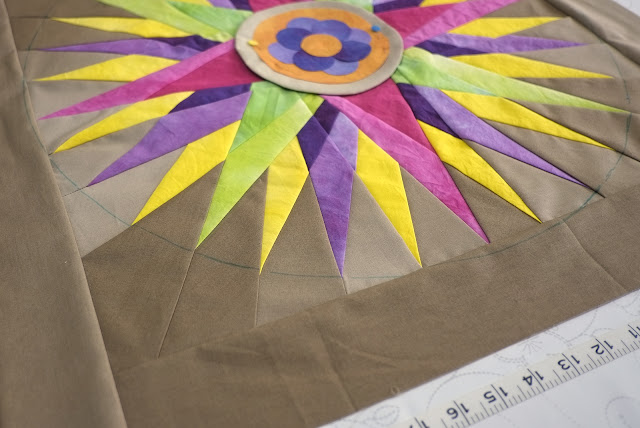
This past year I have really enjoyed playing with colour trying out Charcoal, Iron & Steel, Orange, pale Blues like Fog or Cotton Sky and even loved the darker purple-grey colour of Smoke.

I stumbled across a free download by Lila Rogers of Make Art that Sells and she identified the neutral colours to include that ground artwork as:
• Cool grey
• Orange
• Cream
• Navy
• Black
• Sky grey-blue
• Olive
• Red

I am happy to say that in the last year most of these I had tried but not Olive or Red. I'm liking the look of Olive so maybe that might be the next colour exploration. What about you - any go to neutral you use all the time for your quilt backgrounds? Tempted to try any of these?
I guess what I live about art and modern quilting is that I am not afraid to try something really different. I am planning a quilt with a deep plum color as the main negeatuve space color right now... I have to admit I don't often use red.
ReplyDeleteI use any background that enhances the block and the overall quilt design. It was great to see your beautiful quilts together and read about them.
ReplyDelete-Soma
Brown really is the new orange . It's such a strange colour , can look really strong or soooo old lady depending on the shade and contrasts . I must admit i have to admit to being mostly low volume but have been drifting to darker solids too
ReplyDeleteI don't have a go to neutral but if I had it would definitely veer towards the blue end of the spectrum :)
ReplyDeleteThat's a very nice exploration, Ruth! My approach is to have no preconceptions and act depending on the situation - any colour could work as a background, although admittedly pure yellow, orange and red are hard to keep back as they end to jump forward at you, so unless the negative space is the focus of your piece, they have to be tinted or toned.
ReplyDeleteI think I'm guilty of having a love affair with white so this is a great post for me. You have given me much to think about.
ReplyDelete