


Like anything in Photoshop, there are a number of ways to control & add contrast to your images. The Brightness/Contrast command is a global command and affects the whole image. Photoshop’s original algorithm for Brightness/Contrast was easy to misuse and add in too much black. This has since been improved in the current version but a lot of photographers avoided it and used Levels or Curves instead.

Levels displays a histogram (see earlier post for an explanation of the histogram) of the image showing a graph of tones from dark at the left hand side (0 value) to pure white at the right hand side, (value of 255). You can choose each of the colour channels individually or chose a combined RGB graph. The idea here is spread the graph across the tones thereby increasing the difference between black and white thus increasing contrast and brightness. You do this by moving the sliders (small triangles under the graph) up to the point where the curve begins to rise.

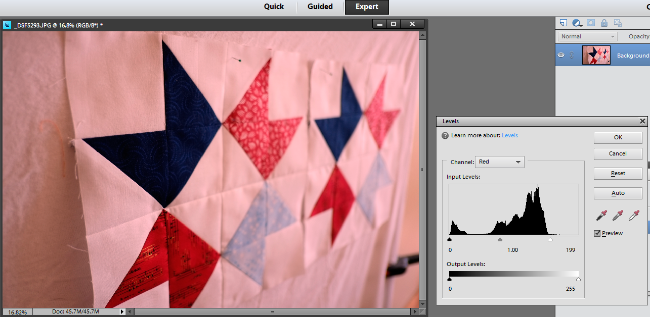 You can do this for each channel individually and tweak the colour in your image or for the combined RGB in one go. If you change the channels one at a time, you will get funny colours in the between steps until all 3 channels have been adjusted.
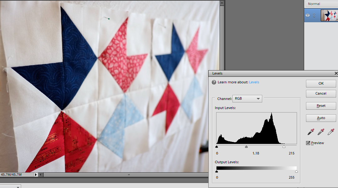 You can do the same for the darks and the midtones by moving the sliders and seeing what the effect is on your image. Adjusting the midtones to the right towards the white, actually reduces the lightness in the midtones and towards the left adds light to brighten your image.
I rarely use the eyedroppers preferring to adjust myself with the sliders but they work by clicking on the white dropper and then clicking on an area in your image that should be white. I'm not a fan of auto adjustments but Levels auto works 95% of the time so try it and see!
As we have seen, Levels can be used to adjust colour and if you use Auto you may find your colours adjusted too. The way I like to use levels is as a layer adjustment from the layers drop down menu.

 Photoshop creates a new layer and the original image underneath is not changed. This gives you a non-destructive workflow. It is important to protect your original against changes you may wish to undo at a later stage and layers is a great way to do this. If you don't like what you have done for some reason, you can always delete or hide the layer by clicking on the eye and the effects will no longer be seen.
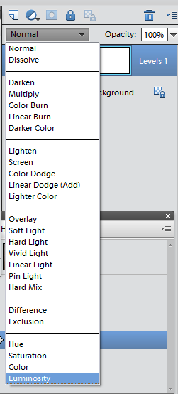
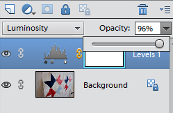
Change the layer type from normal to luminosity and the levels adjustment will only affect the brightness/contrast in your image and not your colours. I like to play with the opacity of this layer often reducing it to 60-65% to tone down the adjustment. This gives lots of control.
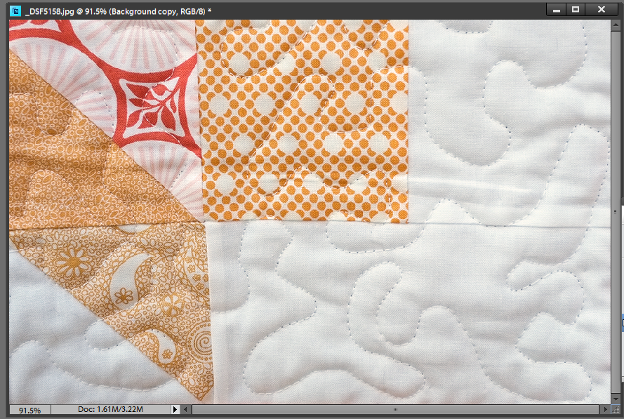
There are other commands like shadows/highlights, curves and equalise that can adjust contrast but after Levels, I like to do a targeted contrast boost to the midtones. This can really give punch to an image if that is the look you want. It's called Local Contrast Enhancement (LCE) and is done using Clarity in Camera RAW or Unsharp Mask in Photoshop or Pixlr. This photo on the left of stipple quilting has had Unsharp Mask applied below (normally used for making things sharper!) and has increased the difference between light and dark in the midtones to give more definition to the quilting.

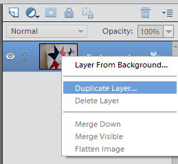
 Again when using Unsharp Mask this way, I like to create a new layer to use it on and adjust the opacity to vary the strength. To do this, right click on your existing layer and select duplicate,
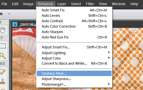
then apply Unsharp Mask from the Enhance menu in Elements. Change the
settings to the following: Amount 20%, Radius 50, Threshold 0. I adjust
the layer opacity to change the strength rather than trying to change
these settings and I find this the quickest way to do this outside of
Camera RAW.
Again when using Unsharp Mask this way, I like to create a new layer to use it on and adjust the opacity to vary the strength. To do this, right click on your existing layer and select duplicate,
then apply Unsharp Mask from the Enhance menu in Elements. Change the
settings to the following: Amount 20%, Radius 50, Threshold 0. I adjust
the layer opacity to change the strength rather than trying to change
these settings and I find this the quickest way to do this outside of
Camera RAW.
Camera RAW and hence Lightroom, has Clarity (same as LCE) as part of the workflow in processing your image. Camera RAW allows you to not only apply a positive value of Clarity to increase midtone contrast (leaving highlights and shadows alone), it also allows you to apply negative Clarity to your image.
Tip: While not that useful in quilt photos if you are taking portraits and want to even out skin tone you can use negative clarity to to do this. It has the most natural effect when added manually using the adjustment brushes in Lightroom as applying it overall can soften the image. If you want to emphasise every wrinkle and have a grungey look then add positive clarity!

LCE or Clarity is very useful for cutting through haze in images and reducing the effect of lens flare. Landscape photographers love it and you will find a preset in Lightroom for it on the left hand menu in the Develop Module and yes, it is called Punch!
 The remaining two sliders on the Camera Raw basic panel are Vibrance and Saturation.
Remember areas of different saturation can give you colour contrast.
The remaining two sliders on the Camera Raw basic panel are Vibrance and Saturation.
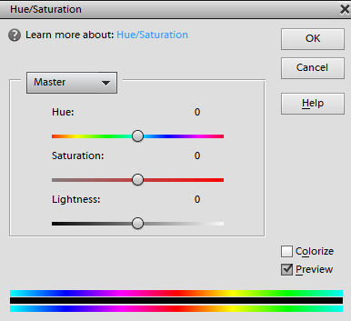
Remember areas of different saturation can give you colour contrast.In Photoshop elements the Hue/Saturation command will let you adjust each colour individually or all colours under Master. I don't like this command much and unless I really have an issue (red sometimes can be problematic!) I prefer not to change the Hue, Saturation or Lightness with this and prefer to use the Sponge command instead if I want to paint on saturation in a specific area.


The easiest way to add saturation globally is with Camera Raw. Have you ever added saturation to an image with a person in it and their face has gone a horrible shade of scarlet? Well Vibrance can help. Vibrance protects skin tones and allows other colours to be adjusted. Vibrance is what I use most if I need to make a saturation adjustment.

Next week, I'm looking at a warmer processing technique that gives a vintage or summery feel to our daylight images and can really make your photo shine!

I really love the levels adjustment - one of my favorites and it is usually the first thing I adjust before tweaking anything else about a photo!
ReplyDeleteHi Ruth, Why would you recommend shooting in Raw instead of Raw + jpeg fine? I ask because when I bought my Nikon D3200, they representative said to use the Raw + jpeg fine setting for photographing quilts.
ReplyDeleteWhat has been your experience? Thanks.
Not every computer can read the camera makers proprietary RAW files and shooting RAW+JPEG gives the ability to view images quickly in file manager or windows explorer on any computer and share the JPEG same day. The RAW file will need processing. Personally I don't use RAW+JPEG very much as I import all my RAWs to Lightroom and star the ones I want to keep and process them there. When I am thinking in B&W it can be helpful as you get a B&W snapshot when reviewing the JPEG on the camera and it keeps me in B&W mode in my head, if that makes any sense?
ReplyDeleteI've used JPEG a lot on these posts as not everyone will have RAW. Most compacts, unless you have a high end enthusiast one will only offer JPEG. RAW files take up a lot of space, take longer to write to the card but give the most latitude in processing are the best for tricky lighting!